场景
厂家需要做一批产品,每个产品有多个指标。为了对比加工过效果,通过不同的渠道或工艺来实现。
每种工艺的质量统计结果保存一个表格,每个表格有多个衡量指标,每个指标放在每一列,第一行是指标名。
厂家根据统计结果来判断产品的性能定位和工艺的选取。
代码
1. 绘图函数
def plot_bar(pdobjs, colname, barnames, bartot, tspace):
    """
    :param pdobjs: pandas的绘图数据
    :param colname: 绘图指标名
    :param barnames: 不同bar的名字
    :param bartot: 不同bar的数据量总数
    :param tspace: 每组的宽度
    """
    nums = len(pdobjs)
    tspace = tspace / nums
    colors = ["#ff0000", "#00ff00", "#0000ff", "#ffff00", "#ff00ff", "#00ffff", "#000000"] * (nums // 7 + 1)
    fig, ax = plt.subplots()
    for idn, pdobj in enumerate(pdobjs):
        tdata = np.array([float(i2) for i2 in pdobj.index]) + idn * tspace
        tstr = [str(i2) for i2 in tdata]
        plt.bar(tdata, pdobj.values / bartot[idn], color=colors[idn], width=tspace,
                label=barnames[idn] + ":" + str(bartot[idn]), tick_label=tstr)
        for tx, ty in zip(tdata, pdobj.values):
            plt.text(tx, ty / bartot[idn], str(ty), ha="center")
    # yticks = np.arange(0, 1, 10)
    # plt.yticks(yticks)
    ax.yaxis.set_major_formatter(ticker.PercentFormatter(xmax=1, decimals=1))
    plt.xticks(rotation=-90)
    plt.ylabel("同类百分比")
    plt.legend()  # 显示标签
    plt.title(colname)
    # 保存单指标图片
    plt.savefig('C:\统计表\\' + colname + '.png', format='png')
2. 数据处理调用绘图
    indir = "C:\统计表"
    tfobj = os.path.join(indir, "通用工艺1.xls")
    syobj = os.path.join(indir, "新工艺sy.xls")
    syobj1 = os.path.join(indir, "对比sy1.xls")
    syobj = pd.read_excel(syobj, header=0)
    syobj1 = pd.read_excel(syobj1, header=0)
    tfobj = pd.read_excel(tfobj, header=0)
    for onecol in tfobj.columns:
        # 循环处理每一个指标
        tmin = min(tfobj[onecol].min(), syobj[onecol].min(), syobj1[onecol].min())
        tmax = max(tfobj[onecol].max(), syobj[onecol].max(), syobj1[onecol].max())
        ntf = tfobj.shape[0]
        nsy = syobj.shape[0]
        nbin = 10
        tspace = (tmax - tmin) / nbin
        trange = [tmin + tspace * i2 for i2 in range(nbin + 1)]
        tlabel = [str(tmin + i2 * tspace + tspace / 2) for i2 in range(nbin)]
        # 数据切分
        bintf = pd.cut(tfobj[onecol], trange, include_lowest=True, right=False, labels=tlabel)
        binsy = pd.cut(syobj[onecol], trange, include_lowest=True, right=False, labels=tlabel)
        binsy1 = pd.cut(syobj1[onecol], trange, include_lowest=True, right=False, labels=tlabel)
        # print(binsy1)
        pdobjs = [
            pd.value_counts(bintf).sort_index(ascending=True),
                  pd.value_counts(binsy).sort_index(ascending=True),
                  pd.value_counts(binsy1).sort_index(ascending=True)]
        plot_bar(pdobjs, onecol, ["通用", "newori", "newcompare"], [ntf, nsy, nsy], tspace)
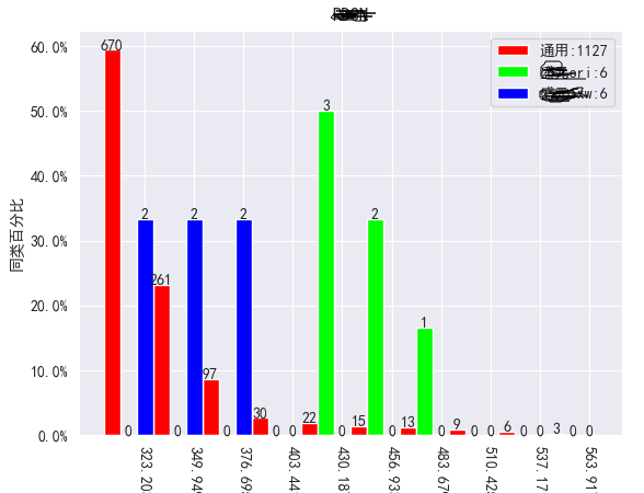
单指标效果示意
右上角是不同工艺的对应的颜色,左边纵坐标为同一工艺质量指标的占比。
横坐标为表格的数据,这里指零件某个部位的尺寸。柱上的值为数量。